
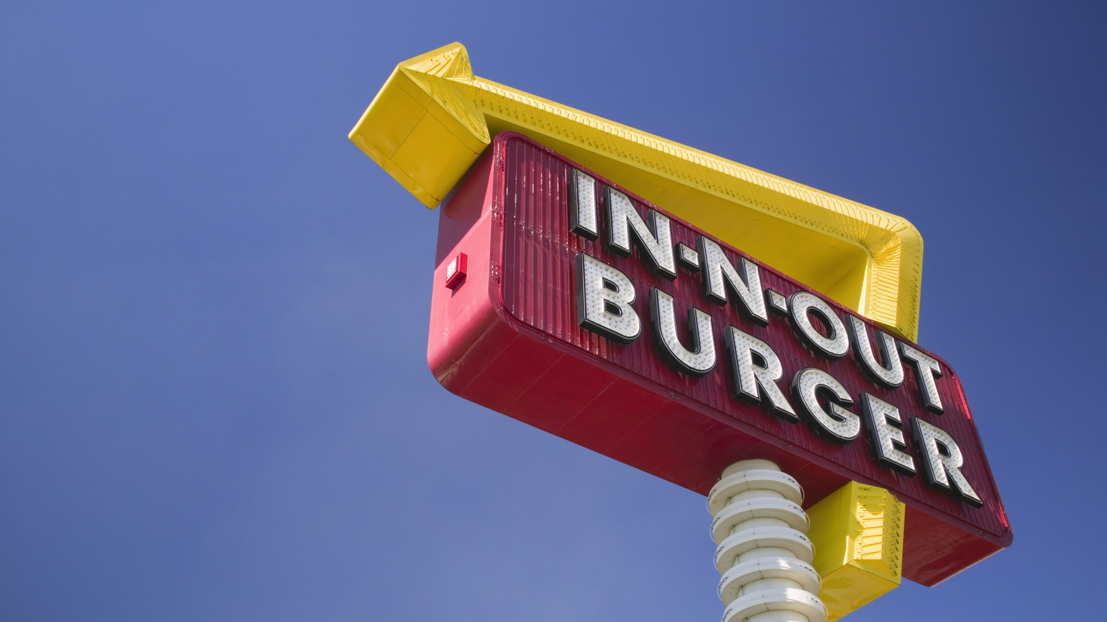
There’s a science happening right in front of our eyes as we walk down the sidewalk or peel off on a highway exit for a bite to eat. It’s not just coincidental that so many of the logos and branding adorning the best and biggest fast food chains in America — from Pizza Hut, Chick-fil-A, to Arby’s, Jimmy John’s, and so many more — are all red. There’s a reason you don’t see too many (with some exceptions of course) purple, pink, black, or turquoise fast food restaurant logos, or for that matter, product branding on grocery store shelves. The long-accepted reason for this is that red, specifically, has the ability to physiologically trigger our hunger. And, so the chains hope, compel more of us to stop in for a bite.
And red doesn’t only make you that much hungrier and more likely to stop in for a fast food burger, sandwich, or order of french fries — red as a whole is a standalone color for grabbing attention. It’s why you see the shade so often on logos for everything from food to streaming services. In a world buzzing with forces competing for our attention, fast food marketers must do everything they can to get us to stop, look, and eat. As if the allure of salty, carb-loaded goodness made fast and sold for cheap wasn’t tempting enough.
The science is murky, but one fact is clear
Colloquially, it’s widely accepted and repeated fact that the color red equals increased hunger, prompting us to seek out and purchase more food than we otherwise might. In the scientific world though, the jury is still out. Some studies on color psychology have indeed concluded that red has the ability to ramp up everything from heart rate to blood pressure to hunger and impulsivity. Other research muddies the waters though, finding no such thing or at least suggesting more research is needed to definitively link colors to hunger cues.
Regardless of red’s impact on hunger specifically, we do know for sure that the color, whether it’s via brain chemistry or just learned responses, makes us pay attention. Red is the first color human eyes can see as we develop, and this may help explain why we’re drawn to it like moths to a flame. After all, there’s a reason red lights and stop signs and other important signage is always red, not baby blue.
Does this mean fast food chains that deviate from crimson marketing can’t be successful? Of course not — here’s looking at you, Starbucks, IHOP, Dunkin’, and even the chain with the single most locations in the U.S., which all choose to be color wheel rebels. But the marketing trend of red fast food branding seems to be here to stay, and perhaps at least plays a role in America’s continuing love affair with the drive-thru lane.


