
When you’re wandering the aisles of a grocery store, what factors do you think drive your purchases? Price tags? Slogans? You might be surprised to learn that colors play a bigger role than most people believe. Here’s the thing: Color psychology sells products using emotion. Marketers purposefully choose display designs to instill specific reactions in consumers. For instance, red increases heart rate and has even been shown to increase appetite. Black oozes elegance, green connotes environmental friendliness, and blue conveys trust while calming the shopper. Statista says as many as 49% of purchases are made on impulse, and whether stores choose red, blue, or green signage can create profoundly varied marketing results. It’s one of the important things to know when buying produce at the grocery store.
A study by WebFX found that 84.7% of customers use color to drive purchase decisions. This natural psychology trick has great potential for store owners. Popular strategies include reds for clearance sales, Valentine’s Day, and even first aid equipment. For beauty products, luxurious yet calming purples or trustworthy, scientific blues are better suited. It’s incredible how deep-rooted the influence of color psychology is in our shopping experiences and psyche. In fact, how our eyes register the world is so impactful that there’s science behind how color impacts taste — the brighter the food, the fresher the flavor we detect.
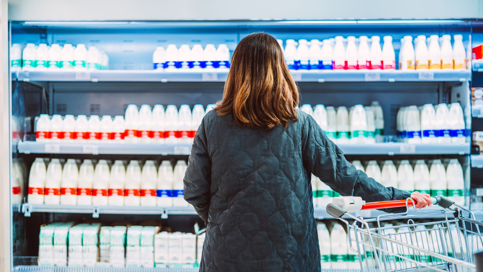
How grocery stores incorporate color

It’s not just a question of bright red clearance signs. Grocery stores also utilize a gigantic spectrum of color psychology hacks, from incorporating colorful zones into supermarket layouts to influencing branding choices. Take Walmart’s logo: The blue conveys dependability, while the yellow emphasizes friendliness and positivity. Logo color palettes shape how we feel toward a product, with some research suggesting they can boost brand recognition.
Supermarkets are mazes of color. Think greens in vegetable aisles to convey freshness and appetite-boosting colors like orange in bakery sections. End-of-aisle displays are attention-grabby, with bright colors to punctuate the customer’s eyeline. The cleverest grocery stores utilize product placement, too. Multi-colored fruits and vegetables are typically displayed as the first thing customers see upon entry. This creates a genuinely positive sensory welcome — the smells, bright colors, and healthy connotations all set the customer up for happier spending.
The truth is our exposure to marketing psychology is constant, even when we’re grocery shopping. Packaging and display colors are just the tip of the iceberg — you’ll never look at your local store the same again. You can even bring the same savviness to your own table by learning the art of pairing the right plate color with the food you’re serving.


