
We know you aren’t supposed to judge a book by its cover … but who can help it? When hungry foodies pass a restaurant, the exterior sign is the first thing they see — and how enticing (or not) that sign appears can attract them to come inside and order (or not). In the highly competitive restaurant scene, successful signage can be an important part of branding. Even the lighting inside a restaurant has a psychological influence on patrons. According to a study by EuroLogo Marketing, 80% of consumers entering a store for the first time do so “because they were impressed or intrigued by the signage outside.” First impressions matter, and while the goal is to grab attention, that attention should be positive, not negative. A shoddy, neglected sign can be a red flag indicating a bad restaurant.
Utility-wise, a good restaurant sign needs to be prominently displayed and physically large enough that folks can easily read it. It should also be easily noticeable, with the bold, distinct color contrast of a light background and dark lettering, or vice versa. That coloring should also reflect brand identity; New Mexico Piñon Coffee, for instance, is one of the largest roasters in the state, and its recognizable signs feature a warm red and yellow color palette evocative of the Southwestern desert. An effective sign has many boxes to tick — but if that sign is left to deteriorate over time and maintenance slacks, any initial effectiveness can suffer.
Ultra-damaged signs can indicate a lousy dining experience … but not always

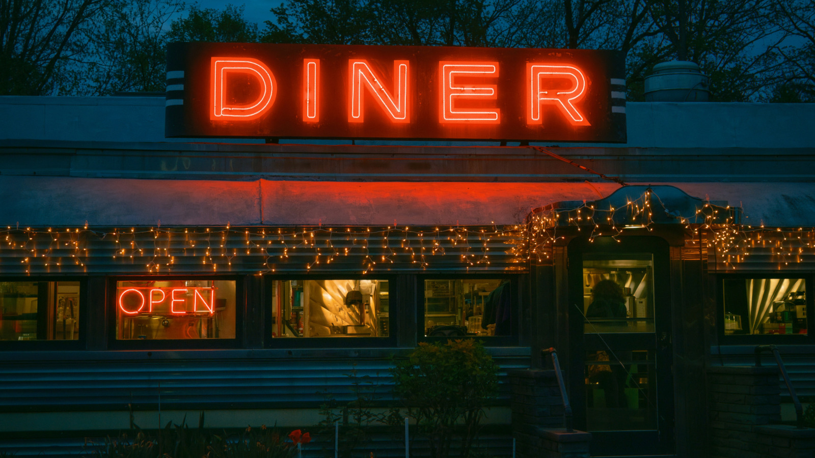
Effective signage is all about self-advertising, and it’s worth noting that appeal to nostalgia can also be an effective marketing tool, if that’s the restaurant’s angle. For foodies seeking a lived-in vibe, cozy diners, roadside barbecue joints, and other longstanding establishments brandishing a yellowed sign with a retro font can carry enormous appeal. It’s the same reason why dive bars in Chicago sport ecru Old Style Beer signs out front: Thirsty patrons know to expect affordable prices and unpretentious digs. In the same way, for foodies seeking a casual, familial atmosphere and not looking to break the bank from their dining experience, don’t let a slightly yellowed sign steer you away.
That said, there’s a line between homey and dilapidated. Intense damage or super-faded lettering to the point of being barely legible is probably not a good sign (pun intended). Many restaurants that primarily do dinner service at nighttime employ illuminated backlit or neon signs; if the lights have gone out on more than a few of the sign’s letters, hungry patrons might keep walking. To further (or alternatively) gauge a restaurant’s quality without actually placing an order, Michelin-starred chef David Chang of the Momofuku empire recommends checking out the bathrooms. If the commode is less than spotless, posits Chang, then there’s a good chance that the kitchen where your food is being prepared could also use a little TLC in the cleanliness department.


